..
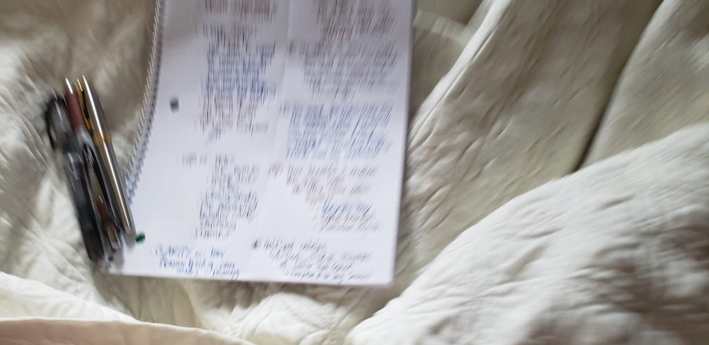
Two-column Wants & Gratitude page in journal today started with a focus on the color BROWN: wanting more brown, and being grateful for all of its richness.

I definitely need to make a better show of this / take a photo with a new sample demonstrating the colors with writing that’s not so private
Not having a good brown fountain pen ink loaded up, I used a retractable Energel with brown ink … and added in two more colors for contrast (and fountain pen smooth pleasure writing): black Preppy and Majestic Blue in my Sonnet. The result is fucking beautiful: a trio I want to return to and improve upon many times.
The Majestic Blue is such a perfect complement for brown. It has the deep rich decadent saturation to feel solid and warm next to it, intensifying the brown experience. The sharpness of black added as a thin accent keeps the mood lush.
Like a thick-walled library in a corner with both shade and light from a window. Deep and solid without being depressing. A velvet-curtained room for the introvert owner in the back of a narrow wood-paneled intimate steakhouse to order the best bourbon from. Not that I’m a big drinker or believer in the big business of meat … but the ambience and flavors: mwah.
TO IMPROVE UPON:
- the watery plastic Platinum black is almost grey — I love it, but for sure a more dense and elegant black would be good in this triad with a fine and precise point, I think.
- the brown of this gel is pretty perfect, but of course I’d prefer it in a fountain pen. I love the warmth of this brown but it might be just a touch too red for my liking. Now that I say that, though, I love the idea of holding steady with my medium point flowing Majestic Blue, and seeing a number of different kinds of browns with it with different levels of redness; this trio will look great with anything from a burgundy-brown and a bunch of other reddish-browns to a more neutral brown to an amber or yellowish-brown. Red (and yellow) also looking great juxtaposed with this particular deep rich blue.
- after finding the “perfect” brown, letting it flow and dominate the page with a fancier fatter line for headings, then scaling down to the medium round tip Sonnet pouring out blue body, and detailing with a fine dark black will provide an excellent level of writing pleasure. I don’t actually have any fancy fountain pen nibs, though. But I could try this with a dip pen in my bottle of Waterman Havane. I still have a long way to go to learn to use fancy nibs, though. I’m not even sure but that I ruined the dip nibs I bought and tried not knowing how to use them (I’m afraid I flexed them too far, if that is possible). {{{shrug}}}
There is a solidness to this trio of colors that I can see building on.
Building plans, charting courses, captaining business. Like owning a big stationary ship that serves as the entrance to a wormhole descending to a wealthy undersea sanctuary city full of art, big calm bubble-sounds, heavy-bound books of impervious classics, and timeless craftsmanship meant to last for centuries. A place only quiet people who value clothes with well-made super-lasting seams and soft thick soles are welcome. Every footstep muted and eyes open wide to deep endless blue-green swirls.
